


![The Fishermen Softball team had their work cut out for them against #2 Norton in the Elite 8 and failed to jump back from an early 7-0 deficit. [Photo courtesy of Dawn Enos]](https://thegillnetter.com/wp-content/uploads/2026/06/709166380_10164685011414728_8841526148411460004_n-1200x801.jpg)
![Abby Noble allowed just two hits across seven innings of work, sending Gloucester to their third straight Sweet 16. [Photo courtesy of Dawn Enos]](https://thegillnetter.com/wp-content/uploads/2026/06/689006146_10164619441929728_5207318100033678928_n-2-1200x801.jpg)
![Boys 4x400m poses with medals from left to right Vincent Mannone, Jefferson do Carmo, Seamus Linehan, Deion Kasera.
[Photo Courtesy of David Coleman]](https://thegillnetter.com/wp-content/uploads/2026/06/IMG_2470-1200x900.jpeg)
![The GHS Softball and Baseball teams are set to enter the playoffs this week, both hosting the Round of 32 on the island.
[Photo Courtesy of Dawn Enos and the MIAA]](https://thegillnetter.com/wp-content/uploads/2026/06/Power-Rankings-1080x1080-1.png)
![The Gloucester DECA chapter poses together after the Grand Award Ceremony. [Photo courtesy of Gloucester DECA]](https://thegillnetter.com/wp-content/uploads/2026/03/IMG_7994-1200x736.jpeg)


The US state flags are laughably bad. While there are many iconic symbols like the California republic bear, the lone star of Texas, or New Mexico’s red Zia sun, the majority of states in the union are represented by a plain monochrome background with the state seal in the center, often incorporating outdated symbols in the process. Fortunately, as recently as 2020, a wave of enthusiasm around improving state flags emerged when Mississippi approved the switch from a flag that contained the confederate battle flag, to a beautiful white magnolia centered flag. Since then, both Utah and Minnesota have officially adopted new flags, and Massachusetts has recently moved to join them.
The current flag
If you are not familiar with the Massachusetts flag, it is probably because it is extremely forgettable. To understand what makes a flag bad, let’s first find out what makes one good. According to the North American Vexillology Association (the largest organization of flag enthusiasts and scholars in the world), a good flag should follow the following five principles:
“1. Keep It Simple. The flag should be so simple that a child can draw it from memory.
- Use Meaningful Symbolism. The flag’s images, colors, or patterns should relate to what it symbolizes.
- Use 2 or 3 Basic Colors. Limit the number of colors on the flag to three which contrast well and come from the standard color set.
- No Lettering or Seals. Never use writing of any kind or an organization’s seal.
- Be Distinctive or Be related. Avoid duplicating other flags, but use similarities to show connections.”
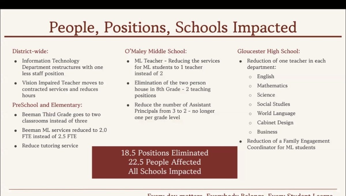
If we were to grade the current flag of Massachusetts, we can see that the bay state only meets 1 of these categories. While the white, blue, and yellow flag has a good color scheme, that is one of the few things it has going for it. The flag is simple at first glance, but upon closer inspection, it is made up of complicated symbols and text that are difficult to distinguish. While the use of an indigenous person on the flag appears to be a nice way to reference the commonwealth’s history, the Native figure is placed ominously beneath the image of a disembodied arm holding a sword, an arm which is supposed to belong to Myles Standish, an early colonist, known for his brutality towards natives. Along with this grotesque piece of history, the flag is also quite boring, as it fits right in with the 25 other barren flags, represented only by their seal.
The process of changing it
In 2020, the state house announced the establishment of a committee to change the flag. As an eager elementary schooler, I tuned into some of these meetings, only for the committee to conclude in 2023 and disappointingly put forward no suggestions. In 2024 governor Maura Healey created a new committee to change the state flag, seal, and motto which represented the indigenous history of Massachusetts. The committee opened up to suggestions from the community and received over 1,000 submissions with varying levels of sincerity. From suggestions as ridiculous as a whale shooting lasers, Governor Healey chugging Dunks, or hundreds of pieces created by kids, the submissions beautifully displayed the creativity of the next generation, as well as the smartassery of bay-staters (I strongly recommend you review some of them)
After reviewing every submission, here are some of my takeaways: As one would expect, many people don’t want any change or a slight tweak here and there, the vast majority of submissions are unusable based on the NAVA rubric, either because they are overly complex, lack symbolism, or simply because they don’t look good, most of the flags have pine tree imagery, and our elementary students need to work on coloring in the lines. After deliberating on the submissions, the committee landed on 3 new seals, flags, and mottos to choose from.
The finalists
While there were many terrible submissions and these 3 are definitely above the average, they leave a lot to be desired.
The “blue hill banner” does perhaps the best job representing the indigenous history of the commonwealth as, according to the artist, “The first element is a blue hill shape located on the hoist side of the flag. The shape symbolizes both the hilly terrain of the state and its indigenous namesake. The state was named for the Massachusett tribe, whose name translates roughly to “at the great hill,” referring to a specific hill that is better known today as Great Blue Hill.” The 6 stripes also represent Massachusetts’ position as the 6th state in the union and the 8 sided star represents a compass, paying tribute to the state’s maritime history. While the symbolism of the flag is well thought out, the flag frankly lacks personality and could benefit from a better format.
The mayflower flag depicts the state flower which represents colonial English history, and is also significant to the Wampanoag and Algonquin nations. The 6 sided star at the center of the flag again represents Massachusetts position as the 6th state in the union, an aspect that many of the submitted flags hold. On a deeper note, 6 may also represent Massachusetts’ position among the 5 other New England states, Connecticut, Maine, Rhode Island, Vermont, and New Hampshire. This flag is simple and has an extremely marketable symbol, but the flag shares themes and color schemes with the Mississippi flag, one of if not the most positively acclaimed state flag, but does not have as much symbolism and the new flag should have its own identity.
The third finalist is likely the front-runner. The 6 turkey feathers again represent the position as the sixth state in the union. Turkeys have been essential to indigenous survival for thousands of years and their feathers are a sacred symbol for several tribes. The circular formation is both pleasing to the eye and represents unity. The maroon color is also unique for a flag and is often associated with many of Massachusetts famous institutions and the legacy of education that goes with them. While this option is the best of the three, it is arguably too simple and the small details are arguably too complex.
After five years of deliberation and thousands of submissions, these three being the final result is relatively disappointing, especially because they do not reflect the majority of the submissions. Of the 1147 submissions, the majority of the flags contained the Massachusetts Pine tree symbol. This symbol, which represented New England independence and pride against colonial oppression, appeared on the back of the current Massachusetts state flag until 1971 and still flies as the state’s naval ensign. The pine tree is native to the area and has aided Indigenous people for thousands of years, it seems like it would be the perfect call to the proud history of Massachusetts. However, despite the clear desire to represent themselves with this symbol, the proud pine tree is absent from the final round.
At the end of the day, the flag that stands behind the governor at press conferences and flies at government buildings is absolutely not the most pressing issue that befalls the commonwealth, and the three finalists are all things considered, not that bad. But as a state that prides itself on its rich historical and intellectual foundation, Massachusetts should not strive to be “not that bad” and instead consider what symbols characterize a strong and forward looking state. As much as it pains me to say, I would urge the governor not to rush, but instead take the progress that has been made, sit down with professionals and experts, and do the state flag justice.
