


![The Fishermen Softball team had their work cut out for them against #2 Norton in the Elite 8 and failed to jump back from an early 7-0 deficit. [Photo courtesy of Dawn Enos]](https://thegillnetter.com/wp-content/uploads/2026/06/709166380_10164685011414728_8841526148411460004_n-1200x801.jpg)
![Abby Noble allowed just two hits across seven innings of work, sending Gloucester to their third straight Sweet 16. [Photo courtesy of Dawn Enos]](https://thegillnetter.com/wp-content/uploads/2026/06/689006146_10164619441929728_5207318100033678928_n-2-1200x801.jpg)
![Boys 4x400m poses with medals from left to right Vincent Mannone, Jefferson do Carmo, Seamus Linehan, Deion Kasera.
[Photo Courtesy of David Coleman]](https://thegillnetter.com/wp-content/uploads/2026/06/IMG_2470-1200x900.jpeg)
![The GHS Softball and Baseball teams are set to enter the playoffs this week, both hosting the Round of 32 on the island.
[Photo Courtesy of Dawn Enos and the MIAA]](https://thegillnetter.com/wp-content/uploads/2026/06/Power-Rankings-1080x1080-1.png)
![The Gloucester DECA chapter poses together after the Grand Award Ceremony. [Photo courtesy of Gloucester DECA]](https://thegillnetter.com/wp-content/uploads/2026/03/IMG_7994-1200x736.jpeg)


In a great victory for those who like legibility (and anti-racism), this past month, the Minnesota Legislature finally published their new design for the state flag. This new flag, which simplifies the former seal-on-blue background design, follows a number of other states following suit. Hoping to end praise for a racist past, these new changes raise national questions about what regional representation means in the 21st century.
The new design is the culmination of years worth of work and lobbying from a number of members of the state legislature, as well as from indigenous groups, who have long derided the flag for depicting the hostile displacement of their ancestors. The flag features the state’s seal on a blue background, with an image of a Native American man on horseback running away from land being cultivated by a white man. The Upper Sioux Community, among a number of other tribal nations in the state, have refused to fly the flag for years.
Starting in 2022, movement began in the Minnesota House of Representatives in support of the change. Spearheaded by Democrats Mike Freiberg and Peter Fischer, the state legislature set aside a piece of the annual state budget in May to establish and fund the State Emblems Redesign Commission. Tasked with creating new potential designs, the committee was made up of 13 members from a number of groups – the Indian Affairs Council and the Council for Minnesotans of African Heritage, to name two – and three randomly selected members of the public appointed by the governor.
After sifting through thousands of suggested flags from the public, they eventually settled on a variant of a design by 24-year-old Andrew Prekker. Thousands of designs were cut, including a particularly popular piece that features a loon shooting lasers from its eyes, as well as a design described so eloquently by the committee as a “psychedelic monkey drawing”.
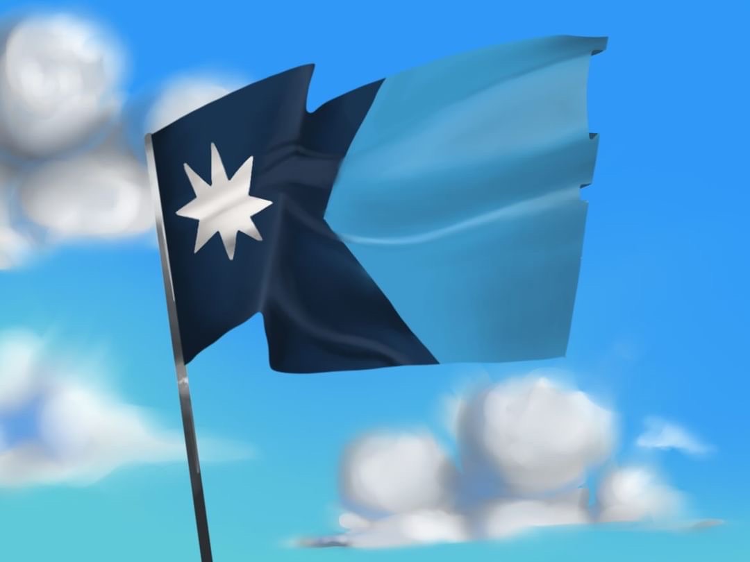
The flag is unique in the world of vexillology, in that it features a dark blue inverted arrow on the hoist side of the flag, which also doubles as a simplified shape of Minnesota itself. The arrow is overlaid on a background of light blue, with a white, eight pointed star on the left side, meant to represent state symbol of the North Star. In addition, the state seal was redesigned, now featuring the state bird and the Dakota phrase ‘Mni Sóta Makoce’, which is translated to ‘land where the waters reflect the sky’, and a surrounding ring of 98 gold boxes to symbolize the 87 counties and 11 recognized Native American tribes of Minnesota.
If no further action is taken by the committee, the flag and seal will become official on May 11th. The flag has been met with significant support from citizens of the Land of 10,000 Lakes, who are proud to rally under a move recognizable, perhaps less racist flag.
So why should we care about the vexillological behavior of the North Star State? Simple – it isn’t just Minnesota making moves to change their flags.
Just a few months ago, Utah finalized their changed design. Much like Minnesota, the old flag was an illegible mess of animals, words, colors and shapes on a blue background. After years of effort, the state finalized a new design set to be officially adopted in a few months. Featuring representation of snow-capped mountains, red rock valleys, and a beehive in the middle, it has been called one of the country’s best flags, though the process to change it was long and arduous.
Conflict grew in the state in response to the unsubtle religious iconography of a beehive in the middle, which has long been a symbol of Mormonism. With a number of legislators and citizens calling on the design as a breach of church and state, the beehive ended up sticking around on the grounds that it represents the ‘community values’ of the state. Gaining political support to include the eight-point star, meant to represent the 8 federally recognized indigenous tribes of the state, became a year-long effort, with numerous debates and referendums to convince the state’s conservative majority of the benefits of the change.
Mississippi ran into a similar situation a few years back. For over a century, the state flag had a Confederate battle flag placed in the top left corner. This was far from ideal, receiving significant backlash over the years for glorifying a racist past. In the wake of the George Floyd protests in 2020, Mississippi governor Tate Reeves released a statement requesting the state legislature to immediately set up a committee to change the flag. The former flag was removed from public spaces and government buildings, leaving the state without a flag for months while the new design was created.
The state eventually settled on a new design, featuring a magnolia, the state flower. As well as 20 stars to represent the state being the 20th to join the union, the new flag removes any trace of Confederate symbols. It was replaced instead with a pattern of five diamonds – an indigenous symbol – and the national motto, ‘In God We Trust’. The removal of Confederate images was met with backlash from the state’s conservative, mostly white, population, who view them as important parts of their heritage.
These are undoubtedly wins for vexillology lovers, and seemingly simple changes at that, but as the country becomes increasingly polarized and convulsed with a culture war, these small changes bring up questions of what regional identity really should be – or if it should exist at all.
Flags fundamentally represent the culture and people of the lands they fly over. But in a country so attached to it’s national identity and national flag, many have argued that such a fuss over regional flags is pointless. After all, most don’t fly their state’s flag, or even know what it looks like.
But I would argue that most don’t fly or don’t know their state’s flag because they are, to use the official vexillologist term, ugly. US state flags have long struggled with unoriginality – most are just the state seal on a blue background, as Minnesota’s once was – but those that rise above this curse prove the significance of their existence.
Take California for example. Commonly called the ‘Bear Republic’ flag, it is one of the most recognizable symbols of the state, commonly printed on t-shirts and clothing for locals and tourists alike. Texas’ ‘Lone Star’ Flag is just about as quintessentially Texas as cowboy hats or barbecue. And it doesn’t have to be famous to be a good representation of local culture. New Mexico’s flag, commonly called the country’s best regional flag, represents it’s mixed history of Native American settlement and Spanish settlement through it’s simple, elegant yellow and gold design. New Mexicans take a lot of pride in the flag, particularly since it represents so many groups that live within it’s borders.
The pushback against direct representation in state flag imagery is still most often the reason why many of these changes do not take place. Cases such as Mississippi’s flag represent the extending tentacles of the culture war, reaching their way into all aspects of local life. The battle for what American identity is has now found its way into the most fundamental representation of a state.
Luckily for Minnesota, most state legislators were in agreement that depicting the displacement is not an important enough part of the state’s identity to warrant it being on the flag. Doesn’t mean that there wasn’t still conflict over the new design, however. A number of far-right media commentators across the country have slammed the new flag with a conspiracy theory that it represents a Somali “conquest” of Minnesota, due to alleged similarities with the flag of Jubaland, one of the states of Somalia.
These connections are tenuous at best, of course. There isn’t any evidence that this was intended – but nevertheless represents a growing tension in much of America between those fighting for representation, and those afraid of what such representation and individuality will do to the state.
Proper representation of a region can exist at the same time as national unity, however. Take England – inhabitants of it’s many counties take great pride in their region, and design unique flags to match. Yet you do not hear about independence movements growing alongside these changes. Derbyshire is not breaking away anytime soon, as they know they can be proud of their local culture, while still being loyal to a greater nation.
For us in Massachusetts, these questions will soon be put to the test, as the state legislature has been working on potential new flag changes for the past few years, to replace our similarly racist current flag. Hopefully, at least, a new flag will have a good design, unique enough to represent our distinct culture.
But no matter the quality of the design themselves, all these changes represent a new era for America – one where longstanding symbols of Americanism are questioned, as we search for what it means to be American in the 21st century.


Gar • Jan 27, 2024 at 10:53 pm
The old state flag was historically accurate and it was beautiful no need to spend millions to change it